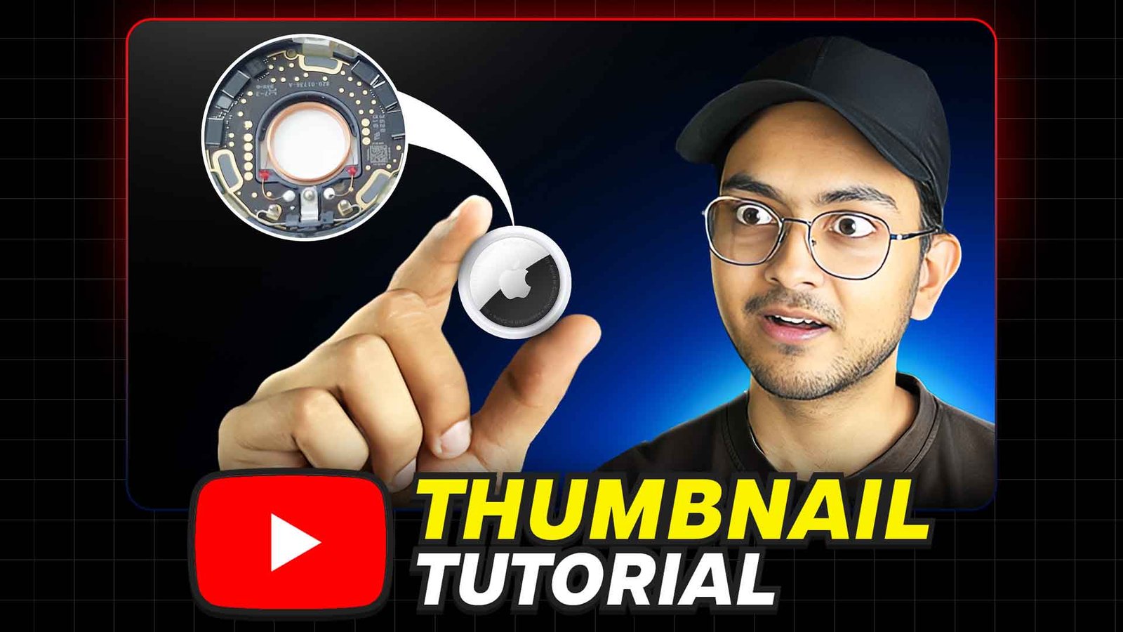
Creating an eye-catching thumbnail for your tech YouTube videos is crucial for attracting viewers and boosting your channel’s visibility. A well-designed thumbnail can make your content stand out in a crowded field, encouraging potential viewers to click and watch. Here’s a step-by-step guide to creating an effective tech thumbnail for YouTube:
1. Understand the Basics
Before diving into the design, it’s essential to understand the key elements that make up a good thumbnail:
- Resolution: Use a resolution of 1280×720 pixels.
- Format: JPG or PNG.
- File Size: Under 2 MB.
- Aspect Ratio: 16:9.
2. Choose the Right Tools
You can use various tools to create thumbnails, from simple graphic design software to more advanced options. Popular choices include:
- Canva: User-friendly and offers pre-made templates.
- Adobe Photoshop: Offers advanced features for more detailed designs.
- GIMP: A free alternative to Photoshop with powerful tools.
3. Capture a High-Quality Image
Start with a high-resolution image that represents your video content. This could be a screenshot from the video or a custom photo related to the tech topic you’re discussing. Ensure the image is clear and relevant to grab attention.
4. Add Text for Clarity
Text helps viewers quickly understand what your video is about. Here are some tips:
- Keep it Short: Use concise, impactful words.
- Bold Fonts: Choose bold, easy-to-read fonts.
- High Contrast: Ensure the text color stands out against the background.
5. Use Eye-Catching Colors
Bright and contrasting colors can make your thumbnail pop. Stick to a color palette that aligns with your brand and avoid overly dark or dull colors.
6. Incorporate Your Branding
Include your logo or a consistent element from your brand (like colors or a specific style) to make your thumbnails instantly recognizable. This helps in building a cohesive brand identity.
7. Add Tech Elements
Since your channel focuses on tech, incorporating tech-related elements can make your thumbnail more relevant. Icons, devices, or patterns related to technology can add a professional touch.
8. Create a Balanced Composition
Ensure that all elements in your thumbnail are well-balanced. Avoid cluttering the thumbnail with too much text or too many images. The focus should be clear, and the layout should guide the viewer’s eye naturally.
9. Test and Optimize
After creating your thumbnail, test its effectiveness. Compare click-through rates (CTR) of different thumbnails to see which design performs better. Use this data to refine your approach.
10. Stay Consistent
Consistency in your thumbnails helps build a recognizable brand. Use similar styles, fonts, and colors across all your videos to create a unified look.
Software Required – Adobe Photoshop
(Please Allow pop-ups and new windows for this website to download)
